- 首页
- International
- 艾特奖
- 文化节
- 服务体系
-
网站导航
|
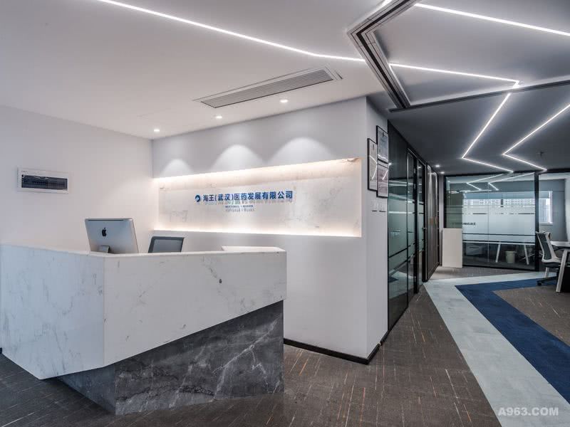
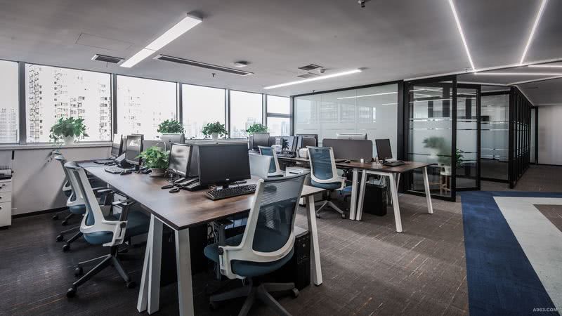
入口处运用磨砂玻璃的半通透性,给予发光字若隐若现的感受,灯光与玻璃让狭长的走道空间得以重生。用利落的异形切割白灰石材所搭配成的前台区域,很好的彰显了医药公司的“精”与“净”。因本案层高的限制,我们采用嵌入式的线条灯与面板灯,不占用办公的整体高度空间。形式上,线条灯的走向与地毯线形勾画方向一致,从前台一直延伸进办公区域,视觉上营造出广阔空间感。横竖向交错搭配的办公桌摆放形式,不仅工整,还使得工作空间得到最大化的利用。设计师将常规的封闭会议室设计成了一个可活动的半开放空间,将会议室与接待室的传统包围性隔墙全部换成可活动的玻璃隔断,既满足办公,会议不干扰的状态,又可满足平日里正常接待与小会议的需求。 |
Neptunus Medical Group emphasized on professional and neatness. JCD extracted blue and white as the main colors from Neptunus Medical Group logo. Blue and white has been using throughout the entire space. The original space of the office was pretty limit, and JCD managed to divide the space into different functional area. Even though the space was small, JCD team found way to push the walls backward so there can be a proper front desk for reception. The unitary of using same color blue all over the space can broaden the sight in order to make the space more spacious. JCD using the glass door instead of solid wall to space apart sections can also enlarge the office. The meeting room is a semi open area which can be an independent meeting room or by store the glass doors and became a larger section for more occupancy. The Neptunus project shows how JCD capable to rational utilization space.

前台

背景墙和发光字

开放办公区1